
Select the desired level between Playout and Program and drag the graphic objects from the lists on the right into the preview pane in the center.
The object appears in the list on the left. Selecting the object, the attributes and effects panel appears at the bottom.
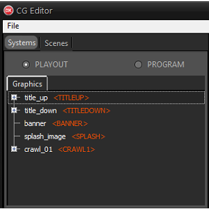
To decide the stacking order, move the objects in the list on the left up or down. The upper objects are shown in front of the lower ones.
It is possible to drag one object into another to group them.
The group can be edited and positioned as a single block, from the bottom pane or from the preview.
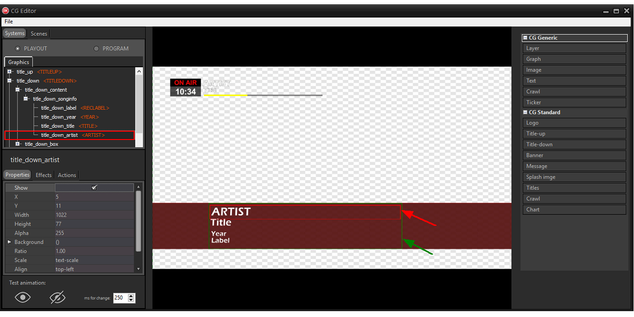
It is possible to modify various aspects of the object, be it in the Playout or in the Program, through three windows:
•The Properties section allows you to change the attributes of the object such as position, size, opacity and color.
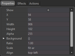
Depending on the type of object selected (for example title_up) additional attributes such as font and alignment for text objects or the path for image objects can be changed.
Size and position can also be changed by selecting the object on the left and dragging or resizing it from the central preview pane.
Enable Show to preview the selected object on the corresponding level (Playout or Program).
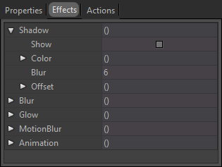
•The Effects section allows you to apply shadow or glow effects or set an animation when the object is shown or hidden.
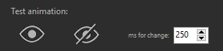
If an animation is set up, you can test the result by using the Test animation buttons below and increasing or decreasing the animation times.
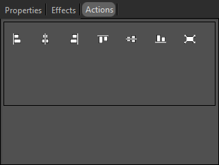
•The Actions section allows you to realign the selected object or to enlarge it in full screen.
By selecting a group, the preview shows two selection boxes: the green box indicates the limits of the entire group, the red box indicates the limits of the single internal object.
Right click on a group or object to rename or clone the element, move or copy the element from the Playout to the Program and vice versa or assign a placeholder to the element.
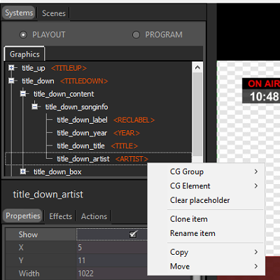
Placeholders identify the graphical components that must be automatically shown by the system in particular situations. They are used, for example, to show and manage titles, logos, lower third, etc.
Groups can have a CG Group placeholder, which identifies the type of component.
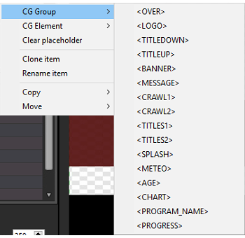
The objects of the group will have CG Element placeholders.
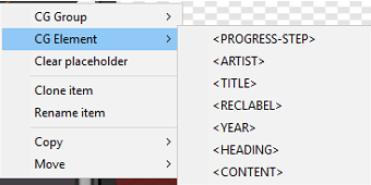
Depending on the chosen CG Group placeholder, the internal objects can have certain CG Element placeholders.
Parts of the image broadcast on the TV channel may be cut off or too close to the border, especially if older TVs are used.
Enable the View > Reference option to show the safe area in the preview pane.
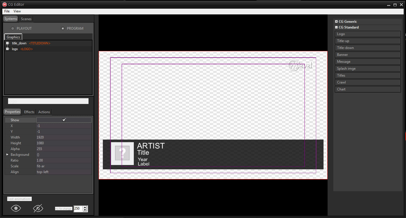
The screen is divided into 3 boxes:
•The innermost box is the title safe area where all the text contents must be inserted.
By placing text objects within the margins of the title safe area the texts will not be too close to the border and will not be cut on some screens.
•The intermediate box, the action safe area, instead shows the limits for inserting graphics such as the logo in the corners of the screen.
•The external part is dedicated to graphic abundances. Some screens may cut off part of this area.
